In week 30, on a Friday morning, we applied something called Grey Listing. I told you that about a week’s worth of information was needed to analyse the underlying statistics on a per-domain, per-sender basis — but least I can do is give you a sense of what the statistics are.
This will consist of two images;
The first image is an aggregate of Munin statistics of all messages declared “delivered” on our external, inbound mail exchangers: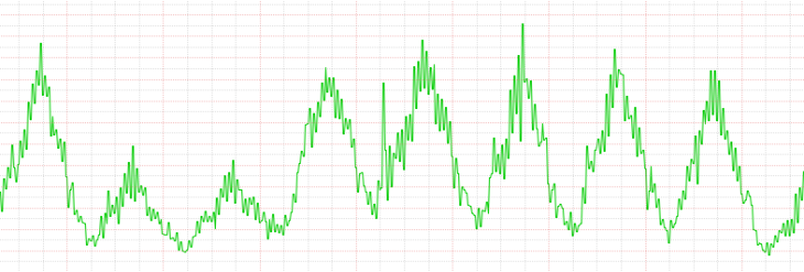
This graph starts with a Friday being the first peak (a work-day), followed by a weekend (largely “quiet”), and another 5 work-days.
Now, to re-iterate, the application of grey listing distinguishes pre-established communication patterns between sender addresses, sender domain name spaces, and recipients, and those that are considered “new” — they haven’t happened before. Effectively, it causes those “new” messages to be delayed in delivery.
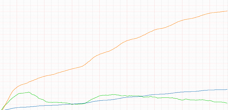
The second image consists of the grey listing database tables statistics.
This is the interesting part, and it’s curvatures are rather well explained by the former delivery statistics image.
The orange and blue lines are white listed. As you can see, none of anything was white listed in the very beginning (and how could it have?).
The green line indicates how much traffic is delayed, by not yet having matched the grey-to-white listing conditions (i.e. no subsequent delivery attempt has been made).
Obviously, the quantity of delayed traffic is going to spike right after you get started applying grey listing.
Obviously, the quantity of white listed tuples is going to quickly overtake the remainder of delayed traffic — unless originally, most message submissions originated with environments that could not queue a message to a spool for another delivery attempt.
We can also see how Saturdays and Sundays basically entertained only few new tuples to be created, and most of the grey listed entries being promoted to either sender-based white listed, or “sender domain”-based white listed.
We can only really recognize it, though, by the Monday clearly picking back up a rate of increase for all entries. Imagine the rates of increase or decline had progressed as they were on Saturday — I for one would have had serious questions.
Now, another symptom we see from these graphs is that there’s fewer delayed message delivery attempts over time. That’s interesting, but also logical; As more individual senders ultimately get white listed, more sender domain name spaces get white listed also — fewer senders will have to await delivery being grey listed, so long as they are either among the then accumulated sender or domain white listed entries.
Our initial analysis of these statistics therefore establish confidence in the level of effectiveness of applying grey listing in an attempt to further mitigate spam, without being prohibitively expensive for our customers and legitimate traffic. Further analysis of our log files will need to determine what, if any, exceptions we’ll need to apply.

What did you use for greylisting?
LikeLike
I used EPEL’s sqlgrey package.
See https://kanarip.wordpress.com/2017/08/03/kolab-now-grey-listing-applied/ for more details.
LikeLike
I have used greylisting for many years with postgrey. In one of my previous jobs the load on the hosting machine fell from around 1 all the time to something much closer to 0, because spamassassin was running less frequently. What we also found out is that spammers avoid domains that use greylisting: we had a few accounts that were whitelisted and they also received significantly less spam. Note: this was about 10 years ago, so might no longer apply.
LikeLike